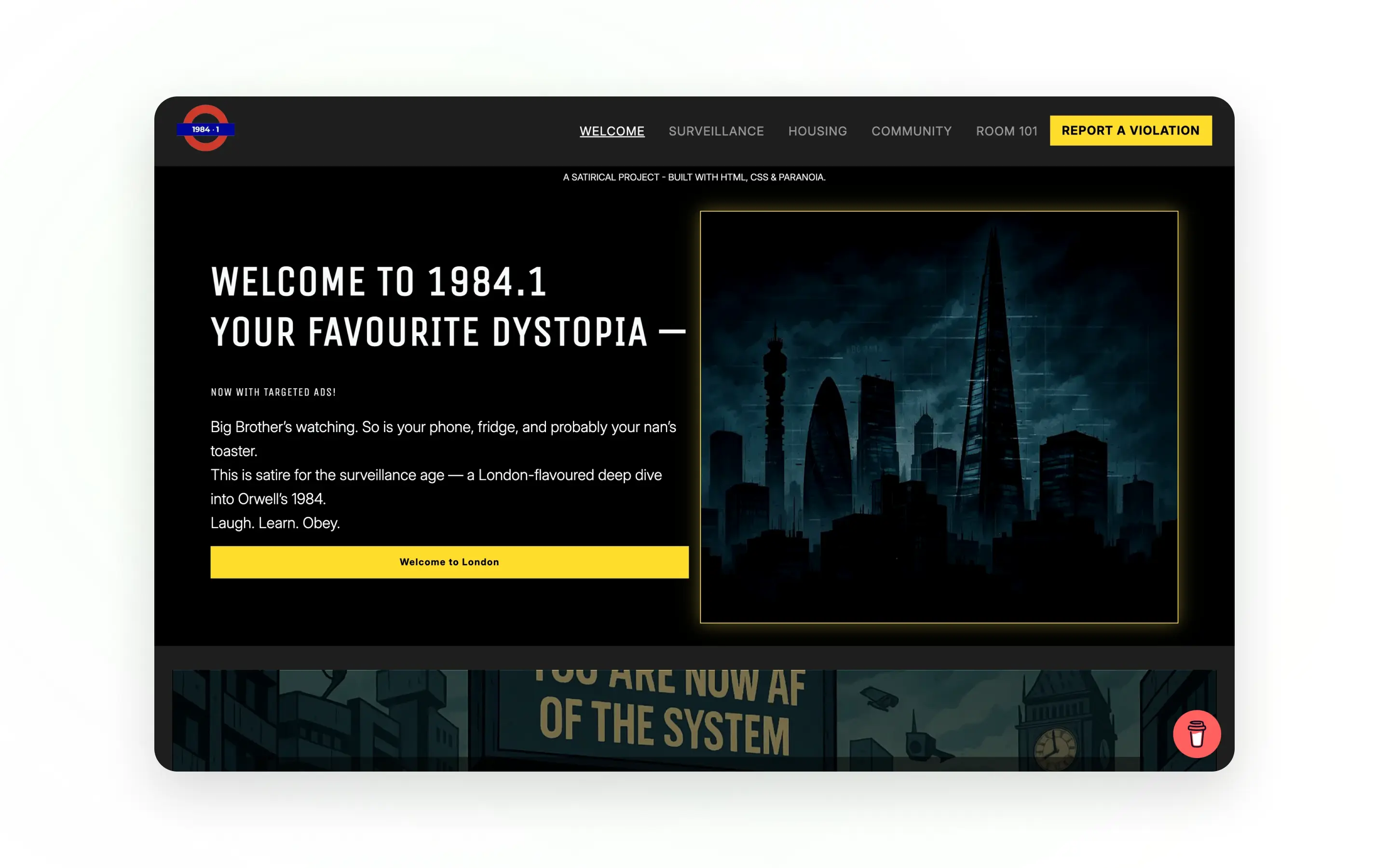
1984.1
1984.1 is a dystopian web experience inspired by George Orwell’s 1984, designed to explore themes of control, surveillance, and propaganda through interface design.
Rather than building a traditional website, this project focuses on how digital experiences can influence perception, guide behaviour, and shape user trust. The goal was to create an immersive, narrative-driven experience that feels intentional, controlled, and subtly uncomfortable.
Role
UX, UI & Front-End Development
Stack
HTML, CSS, JavaScript
Timeline
2–3 weeks
The problem
Most websites aim to be open, friendly, and easy to trust. This project explored the opposite: how design can be used to create tension, restrict clarity, and subtly influence how users feel and behave.
The challenge was to translate abstract ideas like surveillance and control into a digital experience, without relying on heavy interaction or complex functionality. Everything had to be communicated through structure, layout, and tone.
Goals
- Translate abstract dystopian themes into a clear digital experience
- Use UI and layout to influence user perception and emotion
- Create a cohesive tone across content, visuals, and interaction
- Maintain usability while intentionally introducing controlled friction
- Deliver a responsive, polished static site
Process
Discover
I began by breaking down the core themes of 1984: control, surveillance, and manipulation of information. Instead of focusing on features, I focused on feeling — how the interface should make the user think and react.
The key insight was that tone and structure could carry the entire experience. Small design decisions like wording, spacing, and hierarchy could create a sense of restriction without needing complex interactions.
Design
The design focused on creating a controlled, minimal interface that feels deliberate and slightly oppressive. Layouts were structured to guide attention tightly, limiting freedom and reinforcing a sense of oversight.
Typography, spacing, and contrast were used to create tension and hierarchy. Content was written to feel authoritative and one-directional, reinforcing the idea of controlled information rather than open exploration.
Build
The structure was designed to be clean and maintainable, with reusable components and a clear separation between content and styling. Subtle visual behaviours and transitions were used to reinforce the tone without distracting from the overall experience.
The emphasis was not on complex logic, but on execution quality — ensuring that every detail contributed to the intended atmosphere.
Refine & Launch
Refinement focused on tightening the experience: adjusting spacing, improving readability, and ensuring consistency across all sections.
I paid particular attention to how the site feels across devices, making sure the tone and structure remain consistent on mobile, tablet, and desktop.
The final result is a cohesive, polished experience that communicates its concept clearly without over-complication.
Solution
The final product is a controlled, narrative-driven web experience that uses design, structure, and tone to communicate complex themes without relying on heavy functionality.
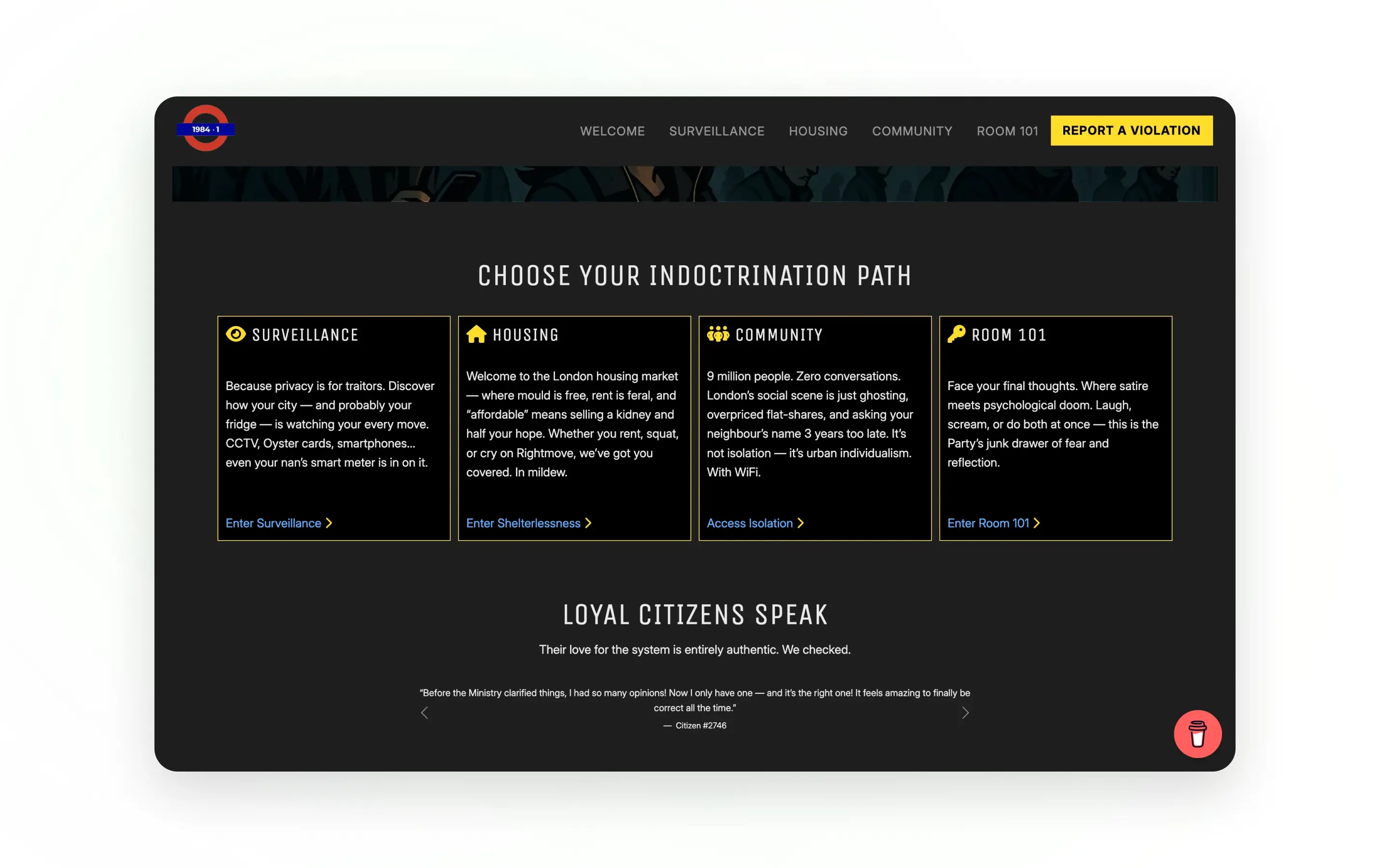
The layout is intentionally structured to guide user behaviour and limit freedom of exploration.
Content is presented in a linear, tightly controlled way, reducing choice and reinforcing the feeling of oversight. Spacing and hierarchy are used to direct attention, creating a subtle sense of restriction throughout the experience.
The experience is shaped primarily through tone rather than interaction.
Language, typography, and visual styling work together to create an authoritative, controlled voice. This approach demonstrates how UX is not just about usability, but also about how a product communicates and influences users.
The project avoids unnecessary complexity, focusing instead on precision and clarity.
By keeping the build lightweight and focused, every design decision becomes more visible and impactful. This reinforces the concept and ensures the experience feels deliberate rather than over-designed.
Outcome
This project demonstrates how web design can go beyond functionality to communicate ideas, emotion, and narrative through structure and tone.
- Clear translation of abstract concepts into a digital experience
- Strong, consistent visual and narrative tone
- Fully responsive across devices
- Demonstrates UX thinking beyond standard usability patterns
- Shows ability to design with intention and purpose
Reflections
This project highlighted how powerful design can be when it’s used intentionally to shape perception, not just usability.
Working on 1984.1 changed how I think about UX. It showed me that good design isn’t always about making things easier — sometimes it’s about creating a specific feeling or guiding users in a particular way.
I learned that tone, structure, and small details can have a big impact, even without complex features. It also reinforced the importance of designing with a clear concept from the start, rather than adding meaning later.
Going forward, I’ll continue to approach projects with a stronger focus on intention — making sure every decision supports both the user and the purpose of the product.
Like this project?
If you like how I think and build, send a message and tell me what you need. I'll reply by email.